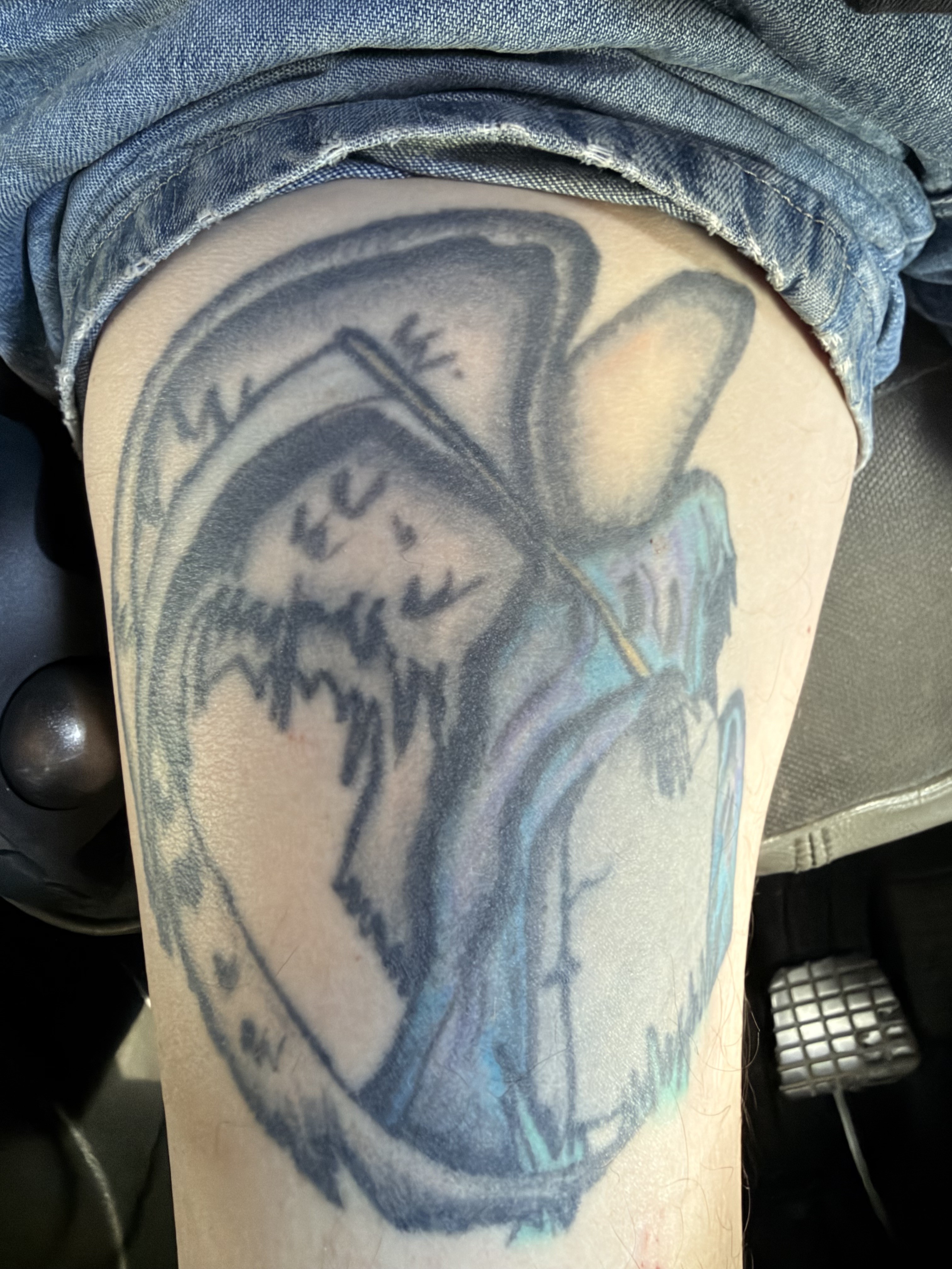
Reapper
Lisa from Miestro's Skin Grafix after she started tattooing
Feedback on "Reapper" The composition here shows ambition—layering multiple portrait elements into a single flowing design takes planning and skill. The member's note about Lisa's progression adds meaningful context to the piece. However, the execution reveals some technical challenges that limit the overall impact. Linework shows inconsistency in weight and confidence. Some lines read clean and deliberate, particularly in the facial profiles, but others appear softer or slightly wavering, suggesting either hand movement during application or inconsistent needle depth. The border framing the composition is reasonably clean, which helps contain the design, but the interior lines lack the crispness expected of established work. Shading is the stronger element here. The grayscale rendering demonstrates decent understanding of light and shadow, with gradation that gives the portraits dimension and prevents them from reading flat. The tonal work on the fabric and facial features shows thoughtful layering. That said, some areas feel slightly muddy where multiple shades overlap, and the transitions could be smoother in places to enhance the photorealistic goal. Readability is solid—the distinct elements remain visually separate despite the busy composition, and the individual faces come through clearly. The placement appears to follow the body's natural contours reasonably well, though the angle and lighting of this photo make it difficult to fully assess how the piece sits at rest or in motion. This is competent work with real strengths in concept and shading, but technical refinement in linework consistency would elevate it considerably. Score: 6.8/10
AI-generated opinion on the craft only — not a substitute for your artist's advice.
1 comments
 James Tandy6 days ago
One of my good Friends Lisa done this years ago..
—
not yet rated
Log in to rate this work.
⚖️ Judge more work